Sign Painting is an Art
Sign painting is, by definition, exactly what it sounds like; it is the the art form of painting on buildings or signboards, advertising a company or product. It is an art form that takes a lot of patience and skill to be able to create clean lines, as if printed digitally. While many graphic designers are designing signages for companies, there is a certain value add that cannot be replicated compared to hand-painted signs.
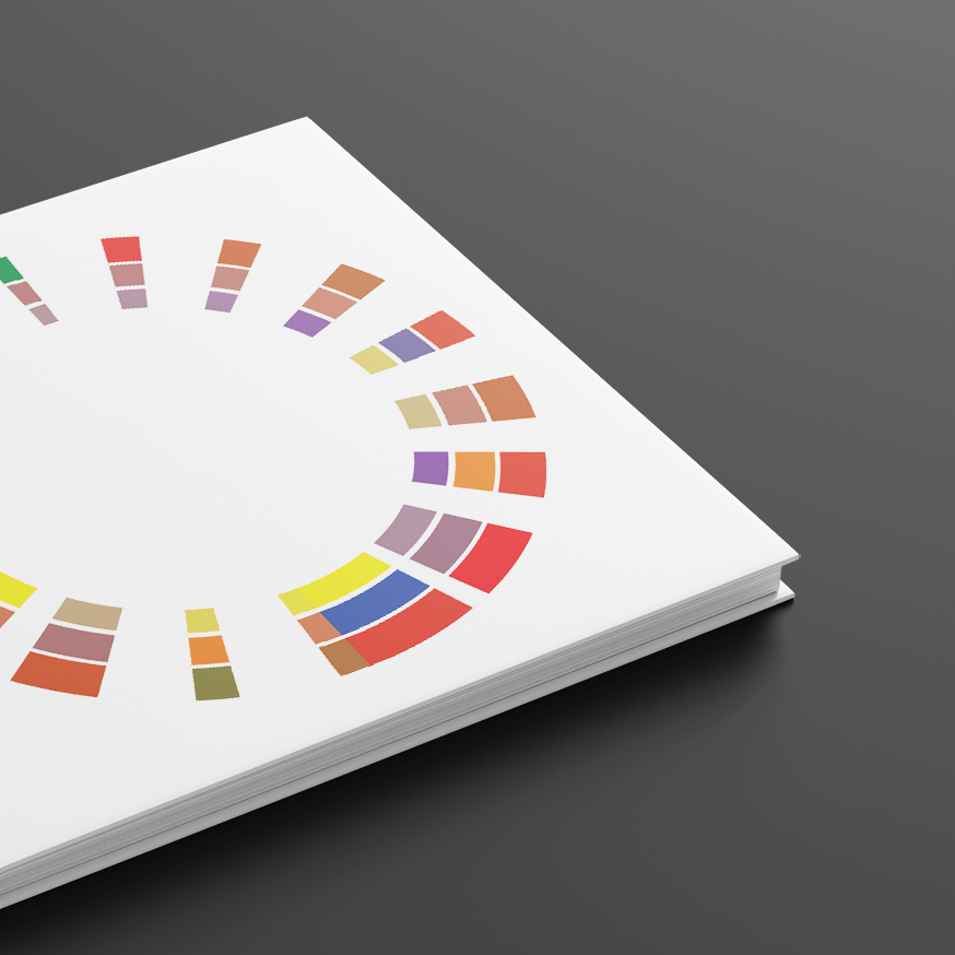
Wander is a display font inspired by hand-painted signs and destination posters. With the restrictions of basic shapes on fontstruct.com, I designed a rectangular font with curved, angled ends and “drop shadow" to allow for a more playful appearance. Using only two colors, the poster demonstrates the font's best use case.

Closeup of poster highlighting Wander font
Back to the Basics
Fontstruct.com is a font building site that utilizes a grid system and limited library of "bricks" for designing the font. It was very apparent that these restrictions would pose as a great challenge in the font design process. Knowing that, I decided to focus on designing three fonts that highlighted the different shapes in the "bricks": triangle, square, and circle. The letters chosen: A, H, M, O and R feature most, if not all, of the variability found in the traditional uppercase letter shapes.

Screenshot of fontstruct.com website font building page
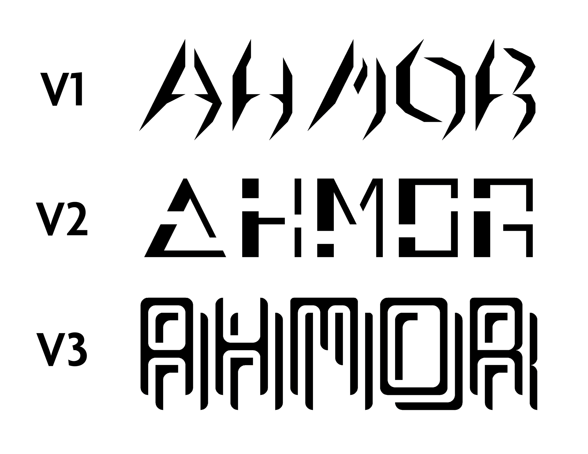
Initial font designs highlighting the different brick shapes: triangle, square, and circle, respectively
Imitation is the Sincerest Form of Flattery
I decided to further develop the third version of the font due to it being most aesthetically pleasing and the letters looked most consistent event with the limited bricks. While the rectangular form shows consistency, the varying letter widths and crossbar heights eliminate complete uniformity. The “drop shadow” adds extra dimensionality to enhance and exaggerate the words.
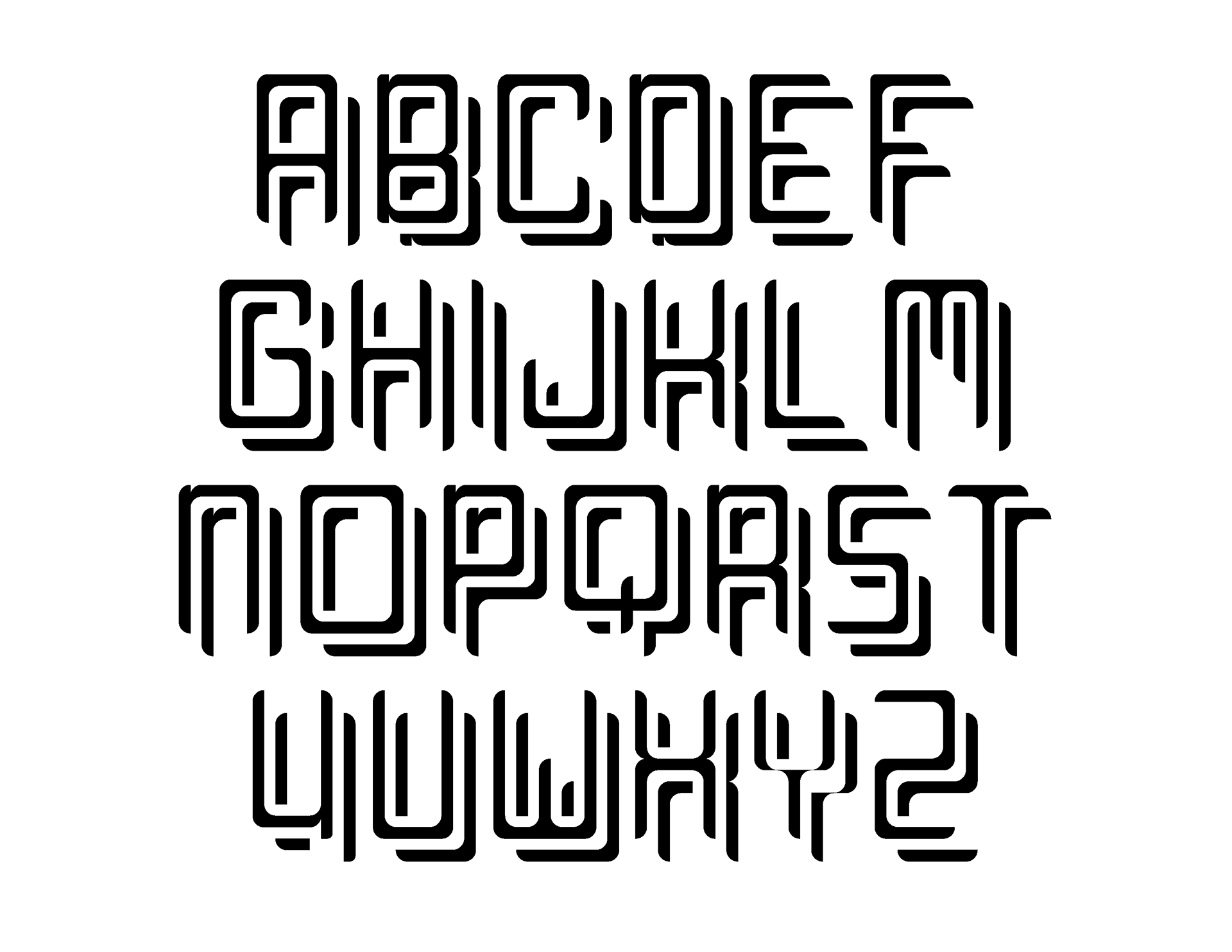
Complete glyph library of Wander
Wanderlust
Due to its form, this font is best used for single words or short brief expressions on posters and signages promoting adventure, travel, and exploration. I designed three poster drafts highlighting the font's playful qualities and the inspiration taken from hand-painted signs. Each one uses the font in a different way: the title of the location, as part of a phrase with a secondary font, and as the background font naming destinations around the world.
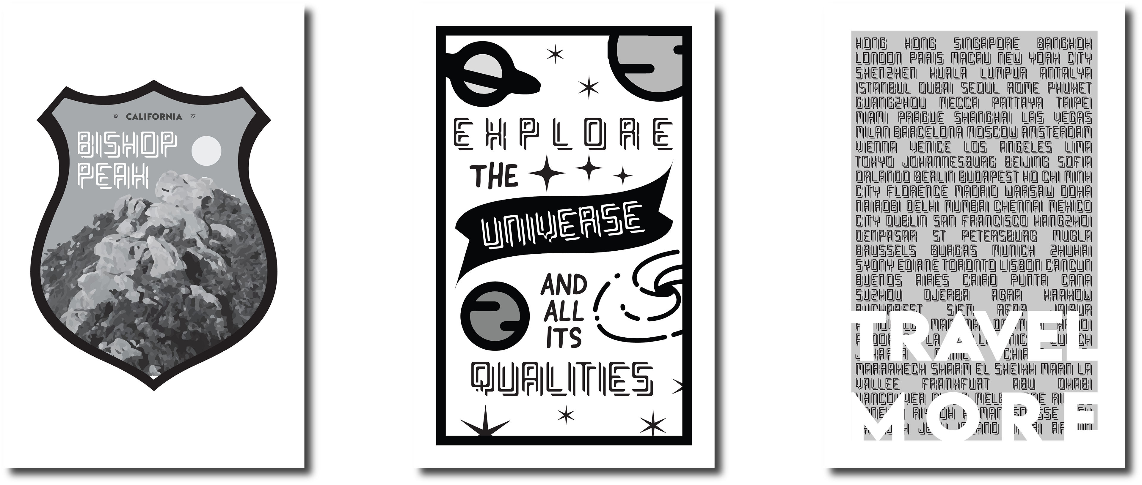
Left poster shows a badge of Bishop Peak, a trail in San Luis Obispo. Middle poster is shows a directive to explore the universe. Right poster shows the top 100 travel destinations in the world.
To Infinity and Beyond
The second version was further developed to create the final poster, highlighting the font as part of a phrase. The secondary font, Sign Painter, was used for the shorter words while the key words were in the font I designed, Wander. I used two colors, one of varying tints, and simple shapes as to not distract from the focus of the poster. The shapes intentionally show small white gaps, to mimic the art technique of screen printing.
Designing a font using a grid with limited shapes really showed me how difficult it truly is to design a font at all. I not only challenged myself to design a font that is inspired by the art form of sign painting, but I took that a step further and challenged myself to design a poster inspired by a different art form, screen printing. Because I studied screen printing in school, it was exciting to try and replicate the style digitally.

Poster at bus stop utilizing Wander font as part of a phrase: "You are the sun to my galaxy"