What's on the Menu?
Menus can make or break the success of a restaurant. A restaurant with too many different cuisines may be too overwhelming or cause the customer to be skeptical of the taste, while too little options may become tired quickly. In addition to the number of items on a menu, ease of navigation is extremely important.
As a frequent customer of Natural Sensations, I became well acquainted with the Mizirawi family, the owners of Natural Sensations. During one conversation, it came up that I was a graphic designer and the Mizirawis inquired if I would be able to redesign their menus because they were outdated. I was elated to be able to work on a project that I would be able to see the results of every day.
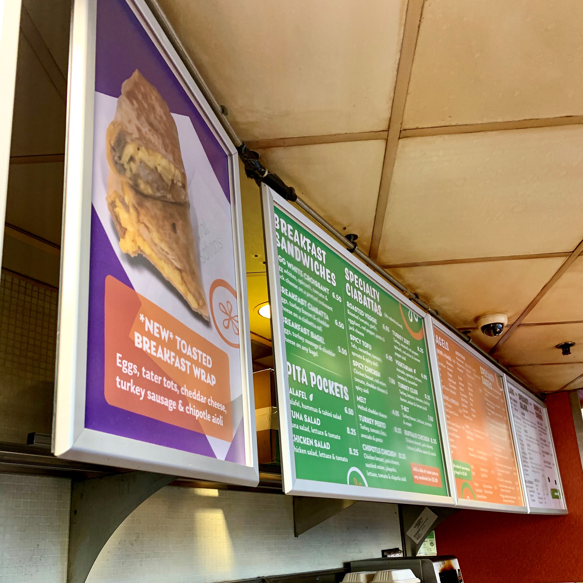
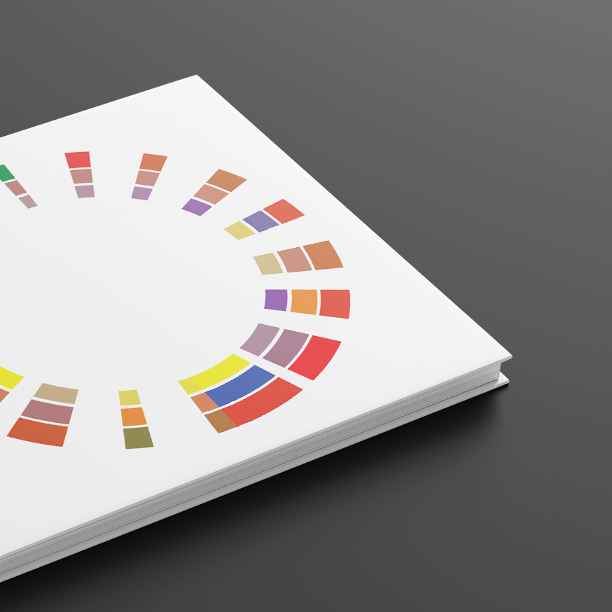
Close up of new item advertisement and a few redesigned menus.
Getting Stale
Before designing new menus, I took note of the problems with the old menus. The first thing I noticed was the inconsistency in the formatting of each menu, as if they were designed by different people. While the fonts were the same for each menu, one menu was center aligned with the others left aligned and the locations of the prices was also varying. There was a lack of hierarchy in some the menus, causing the eye to move up and down unnecessarily. The drop shadow of the titles also made it difficult to read.
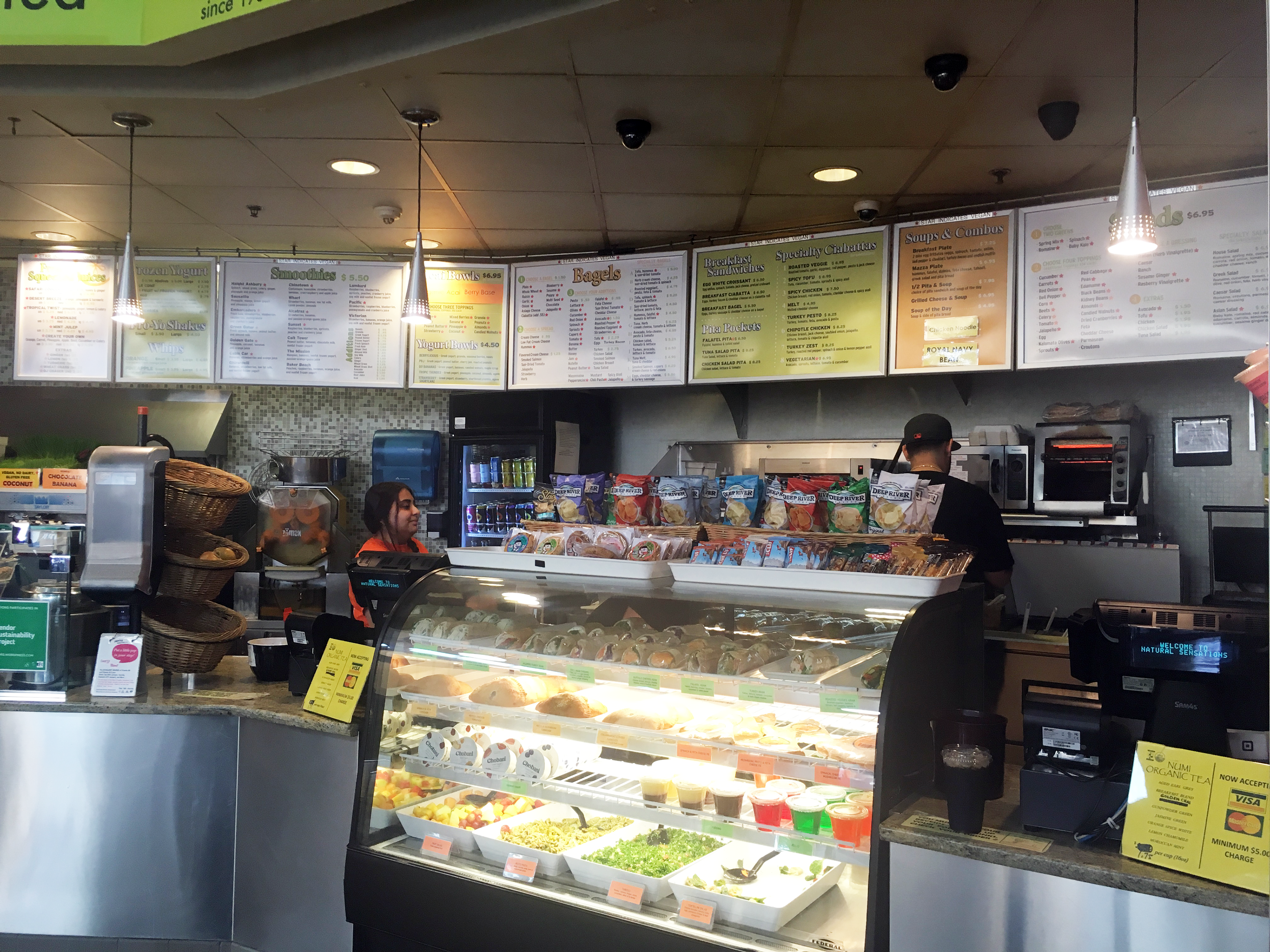
Previous menus as seen from customer line
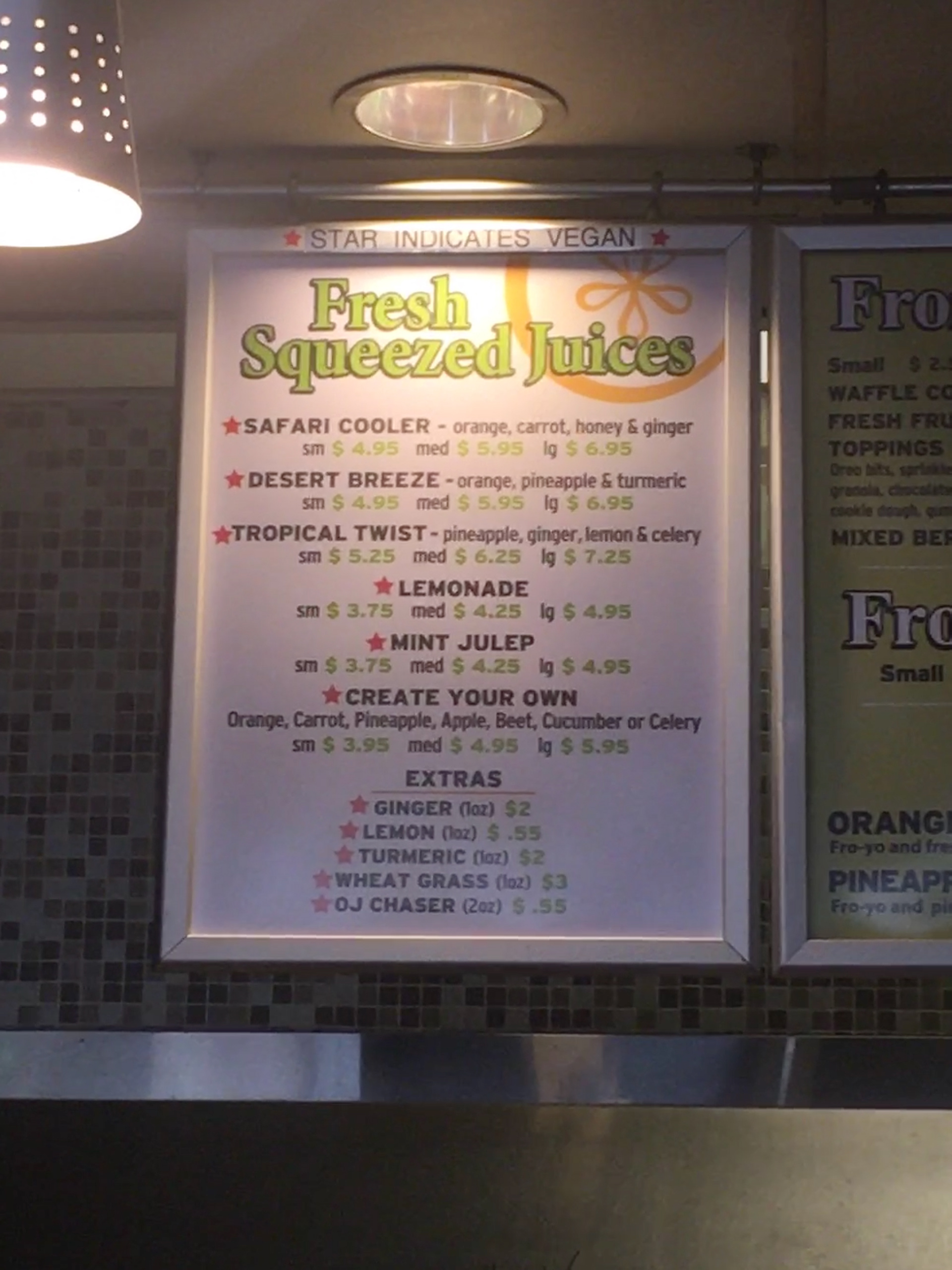
Previous Fresh Squeezed Juice menu
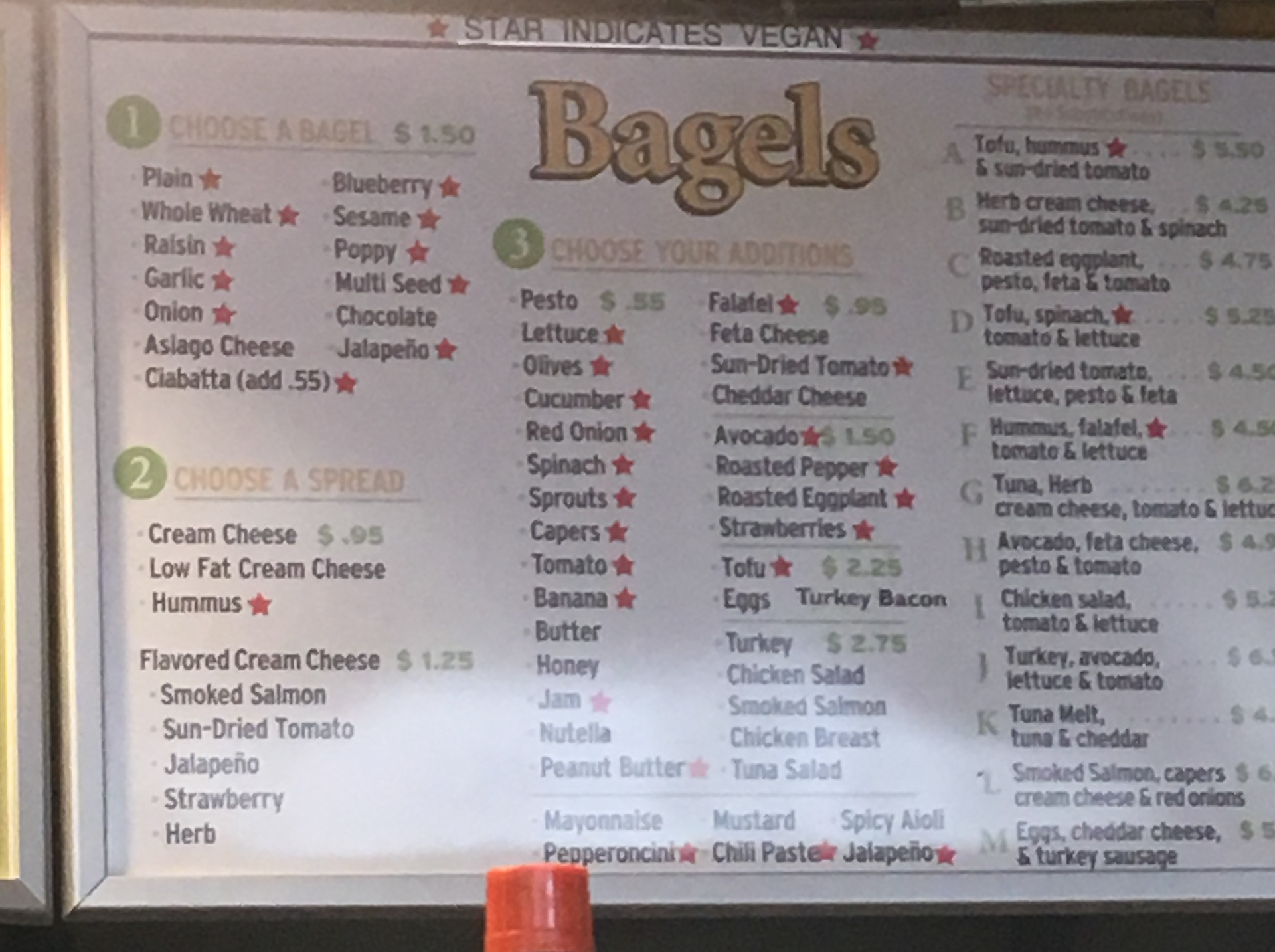
Previous Bagels menu
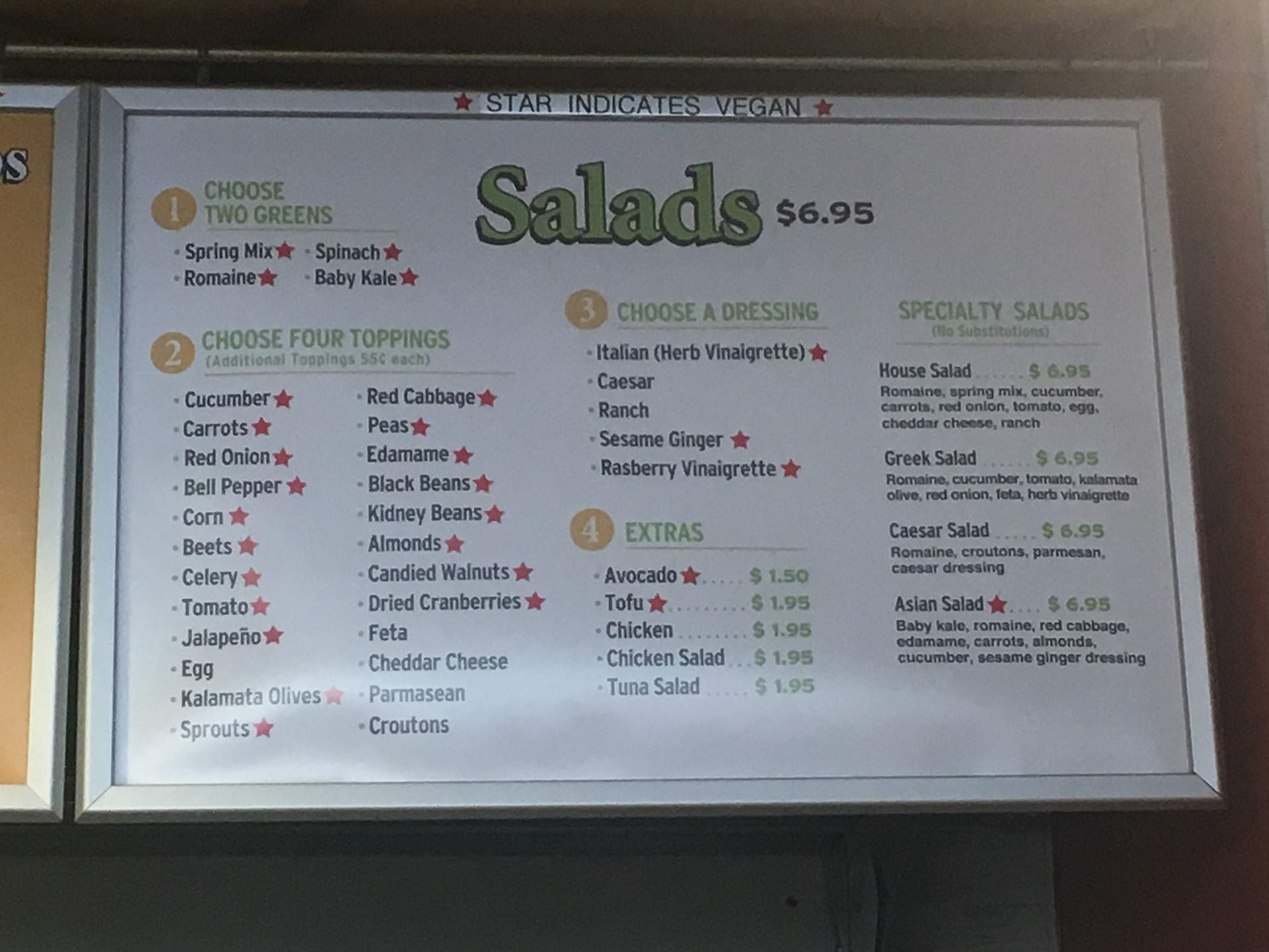
Previous Salads menu
A Fresh Start
Because of the large flow of traffic in the Cesar Chavez Student Center, it is vital that customers can order quickly and efficiently. My greatest challenge was being able to fit all the food options in a limited number of menu frames. After creating a grid for each menu to follow, there was much more available room on each menu. I changed the header font to Coniferous and the body copy to Laca, increasing legibility significantly. I darkened the shades of orange and green to increase contrast. In addition to the large menus, a small set of menus was printed and posted on the side of the establishment for those not yet in line.
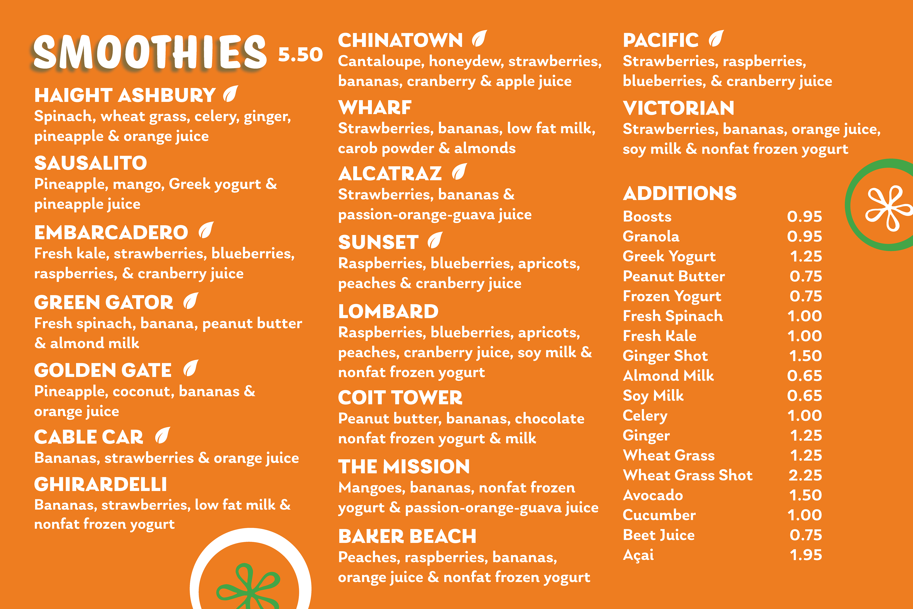
Updated Smoothies menu
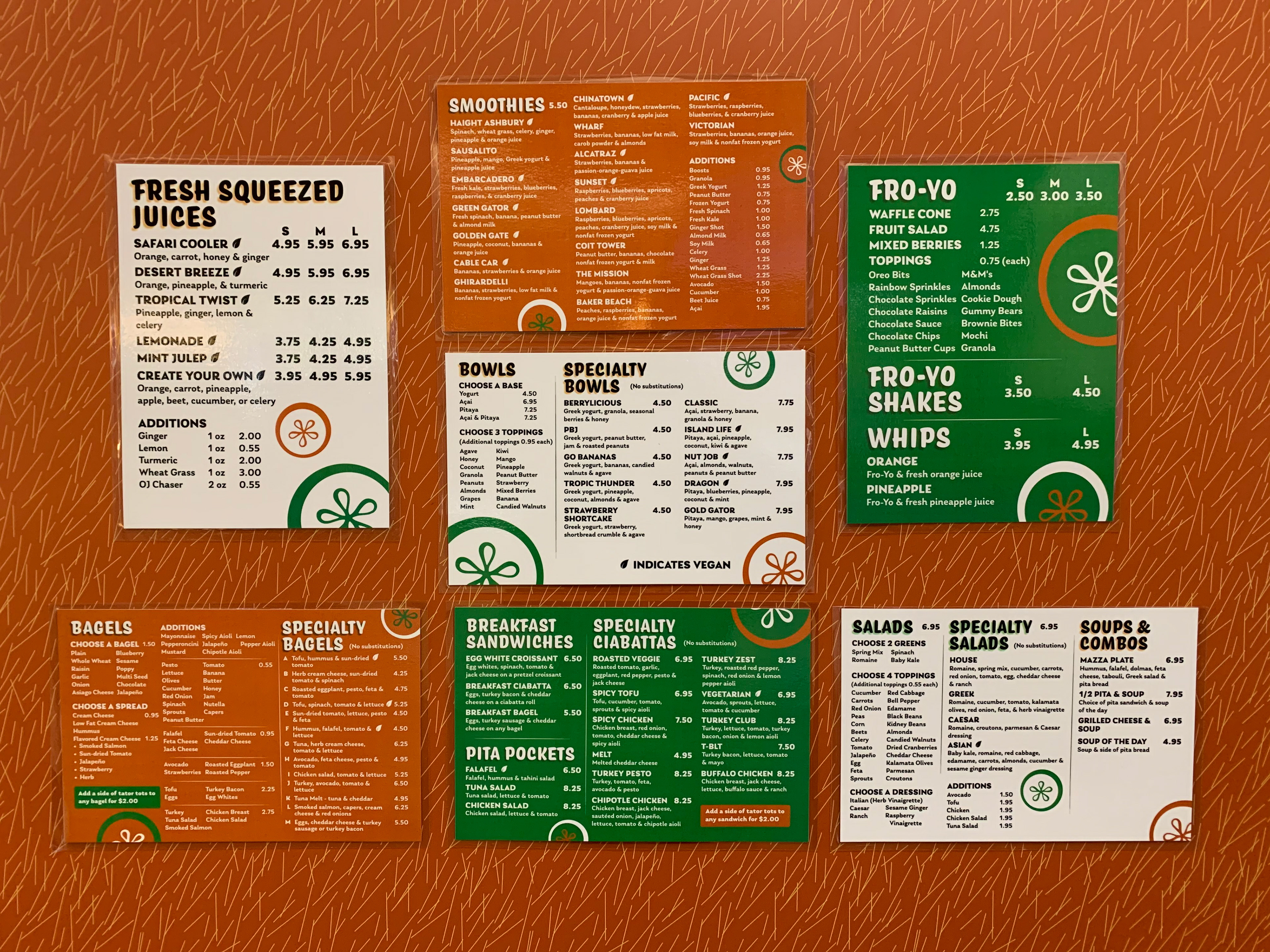
Small printed set of menus as seen on the side of the establishment
Feeding the Masses
Once the designs were completed, I had them printed to ensure that they were sized properly. I also designed advertisements for new items, using the same fonts, but different colored backgrounds so that they would stand out more to customers waiting in line. While continuity and reliability is important to me, I provided the Mizirawis with the working files in case I am unavailable to make a change in the future and a different designer is needed.
Working on this project and then continuing to create advertisements for new items was a great experience as it taught me to really focus on brand consistency. The redesign of the menus greatly increased the flow of customers as well as increased the purchasing of some of the items. Multiple colleagues approached me, commenting on how they didn't even know some of the menu choices existed before. Being able to navigate a menu quickly keeps a hungry person from becoming a hangry person.

Menu view from customer distance with up close view of Fresh Squeeze Juice menu

Entire restaurant view from afar (mural on left also designed by me)