Exploring Associated Students
Associated Students of SFSU is a student-led organization that offers 13 programs, such as Environmental Resource Center and Early Childhood Education Center, and additional services, such as Gator Groceries, the food pantry free of charge to students. The organization is dedicated to the empowerment of the 30,000+ students of SF State.
After more than 5 years without one, I designed the Associated Students Annual Report as a comprehensive report that summarizes the accomplishments and highlights of the company for the 2019-2020 fiscal year. It provides insight into how current resources/funding are being applied to support our students. Many students don't know of the many resources available to them through Associated Students, and this report offers much needed transparency, especially during the virtual modality due to the COVID-19 pandemic.
This booklet received 1st Place Multi-page Publication for the 2020 Steal This Idea Competition held by ACUI (Association of College Unions International) Region I.
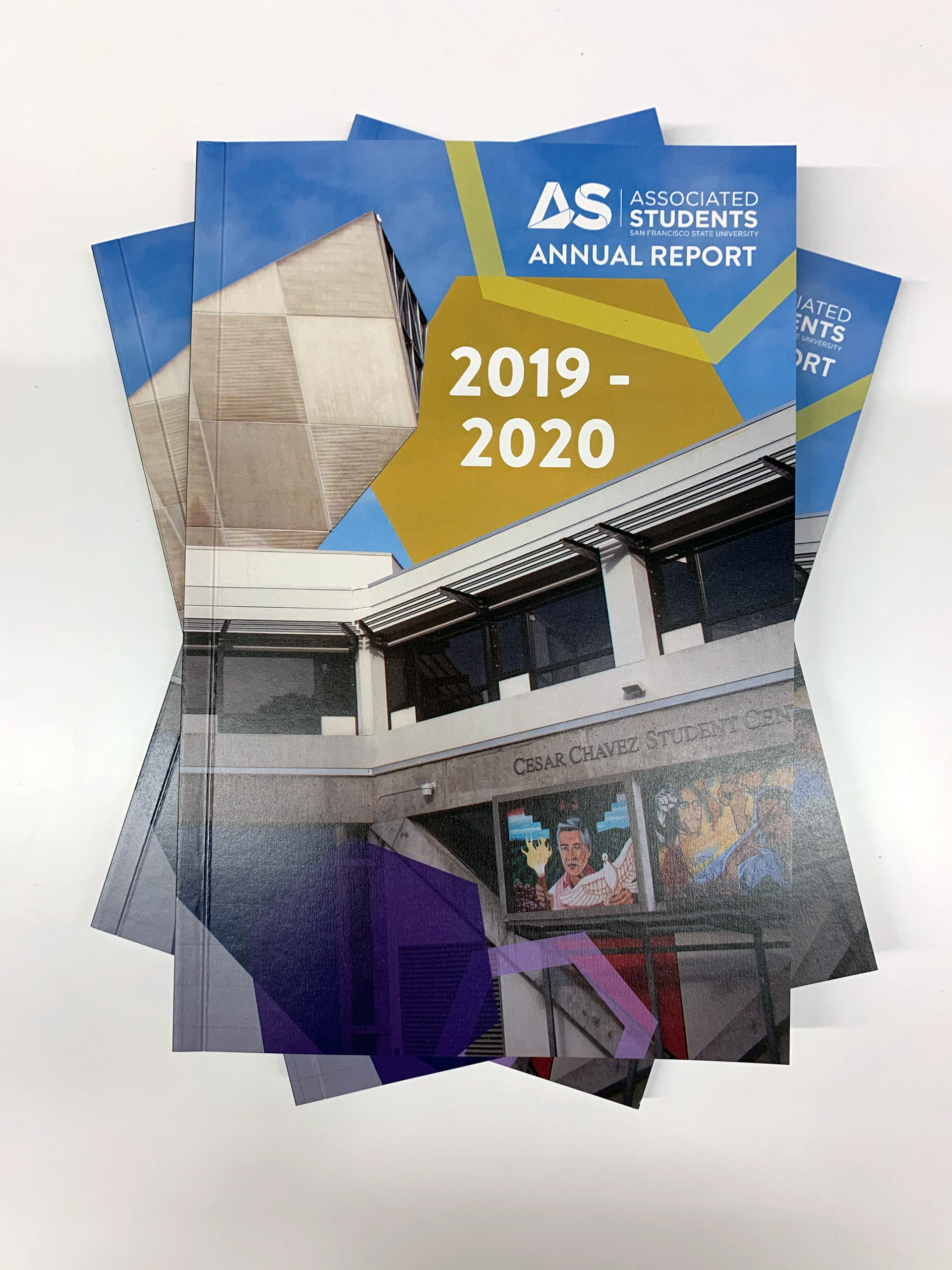
Stacked copies of annual report
Racing the Clock
Due to some difficulties in acquiring all the required information, I was given only 2 weeks to complete the project before the new school year started. There was also the challenge of developing an aesthetic that would tie together an entire organization with its diverse personalities of programs and departments. I drew inspiration from the building the organization is based out of and annual reports of other Associated Students.
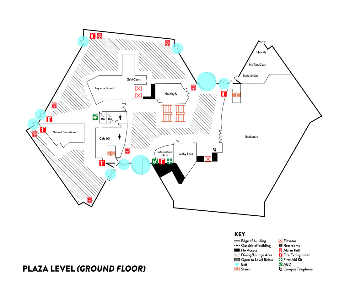
Ground floor map of Cesar Chavez Student Center, where Associated Students is based out of

Cal Poly San Luis Obispo Annual Report page
It's All in the Blueprint
In exploring the historical data and blueprints of the building, I discovered that the shape is based on triangles and hexagons. Though I don't know of the original intent, it was fortuitous that the strongest shape in nature is a hexagon. I used this shape to convey the strength of the company and as the graphical element that would tie the different programs and departments together. I utilized the official company font Brandon Grotesque and a gradient across the various chapters based on the company colors: gold and purple/indigo.
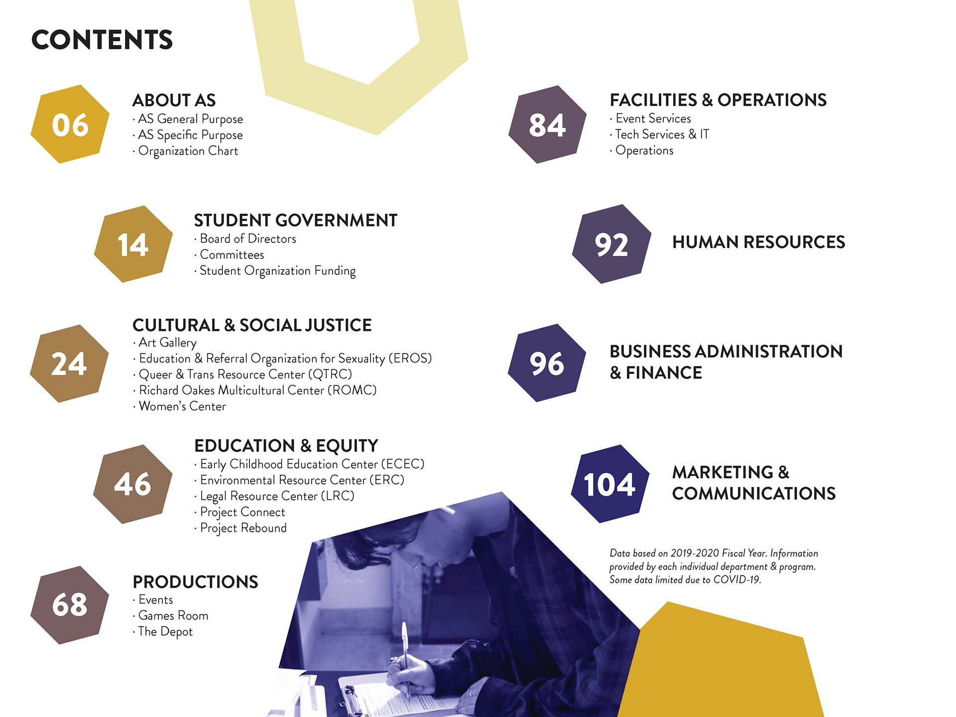
Table of Contents divided by program categories and departments
Pressure Makes Diamonds
With the hexagon theme in mind, in conjunction with the font and color scheme, I was able to design a template for each program and department. The overarching elements allowed the booklet to read seamlessly, while still allowing the individual personalities of each section to shine through. Two weeks and 112 pages later, the booklet was completed and sent to print.
Though there was the pressure of time, I used the restrictions to my advantage. This inspired me to think thoughtfully on how to execute this project as efficiently as possible. The measures I set in order to acquire information and develop ideas can be used for future annual reports. This project, as challenging as it was, allowed me to design something that exemplified my ability to problem solve successfully. My feelings of accomplishment were further validated when it won first place in the Steal This Idea Competition.

Back and front cover of booklet showing the Cesar Chavez Student Center
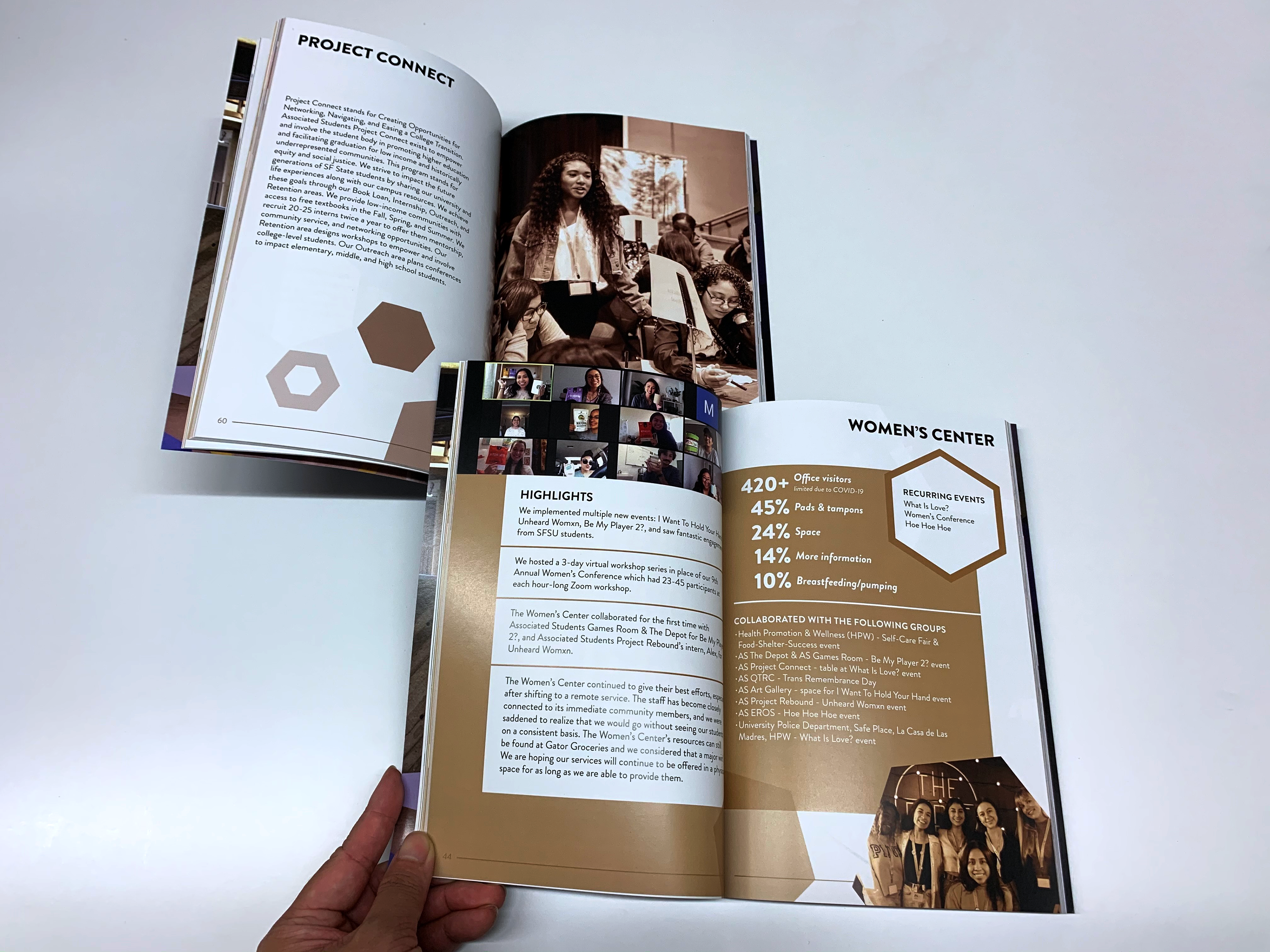
Project Connect introduction & Women's Center information, two programs of Associated Students
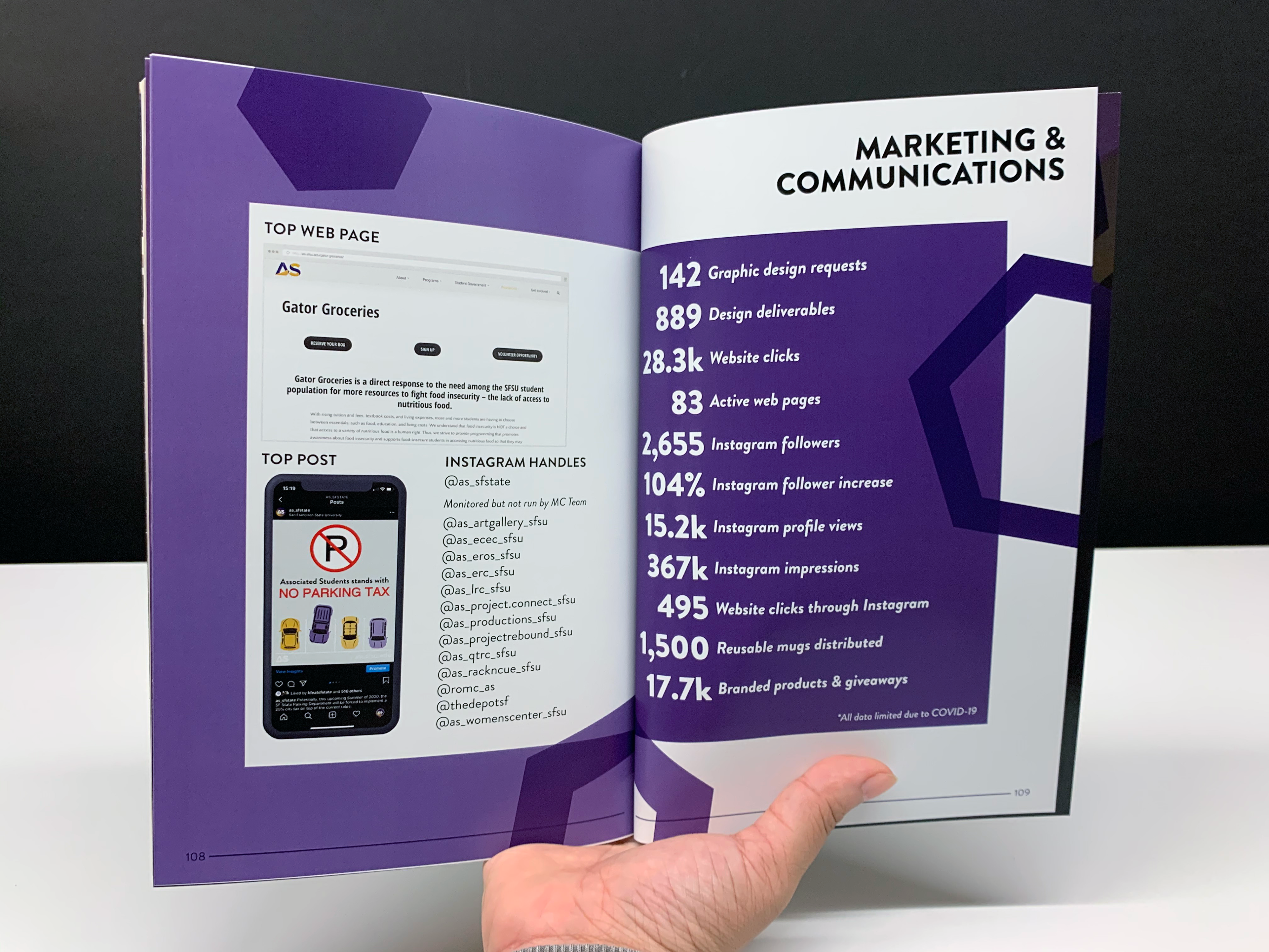
Data related to the Marketing & Communications department during the 2019-2020 fiscal year
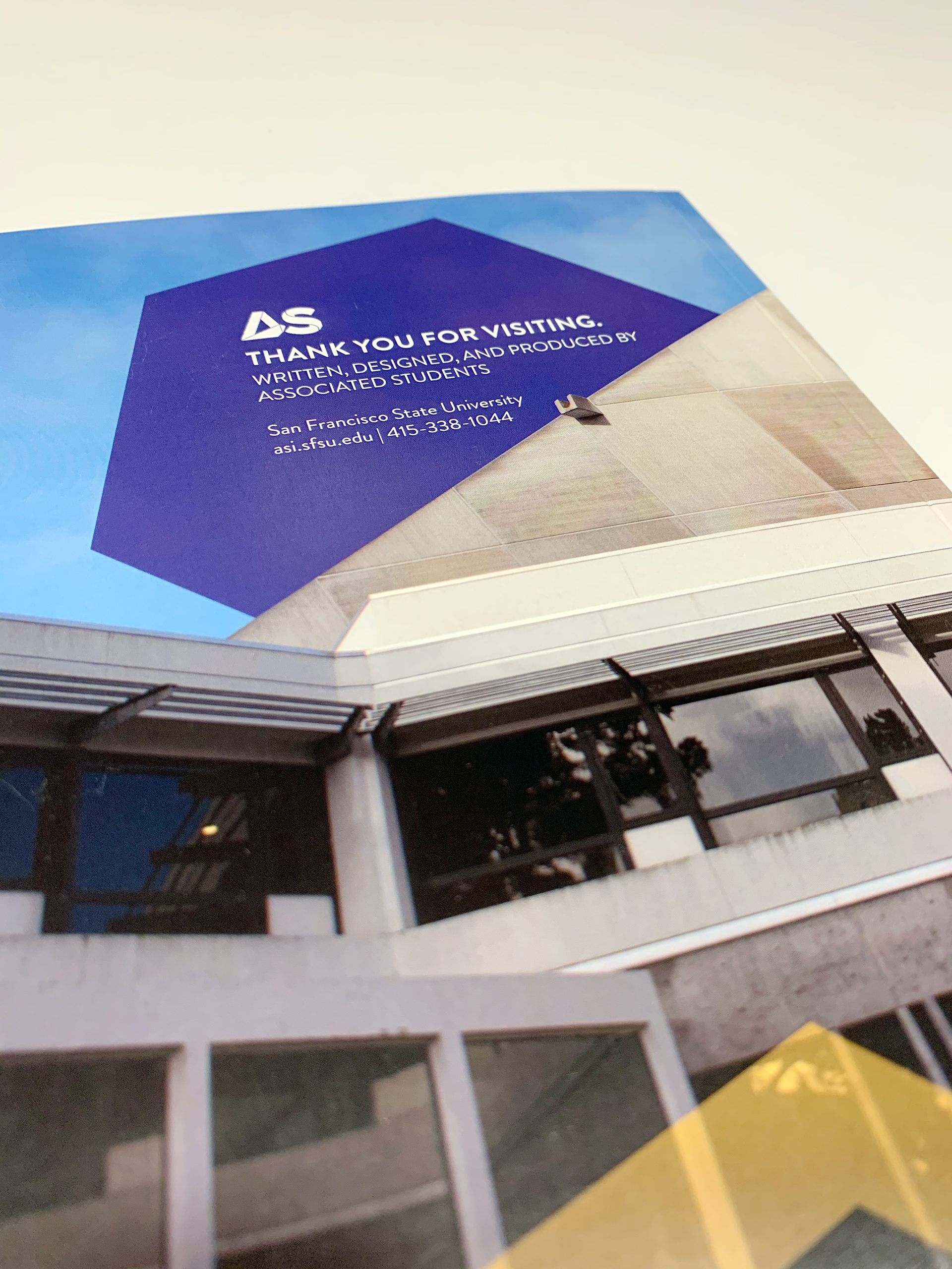
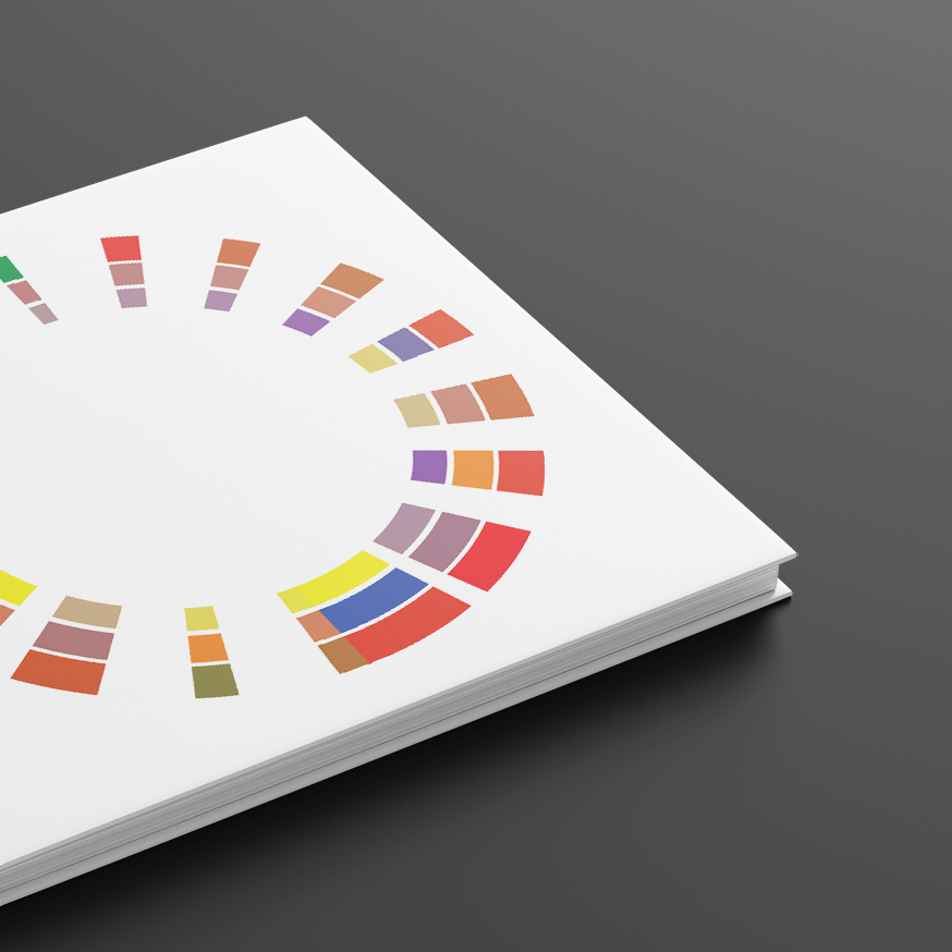
Close up of back cover