The Great Outdoors
Being outdoors offers many different avenues to be one with nature. While some enjoy casually hiking, others tough it out in the wilderness for extended periods of time. Mother nature is unpredictable, and for that reason, many companies specialize in outdoor clothing and equipment suitable for all terrain and conditions.
Acme is a fictional outdoor clothing company designed to compete with such companies as REI and The North Face. Acme strives to deliver top quality outdoor clothing for individuals from the everyday explorer to the most ambitious athletes, with an emphasis in high performance, endurance, reliability.
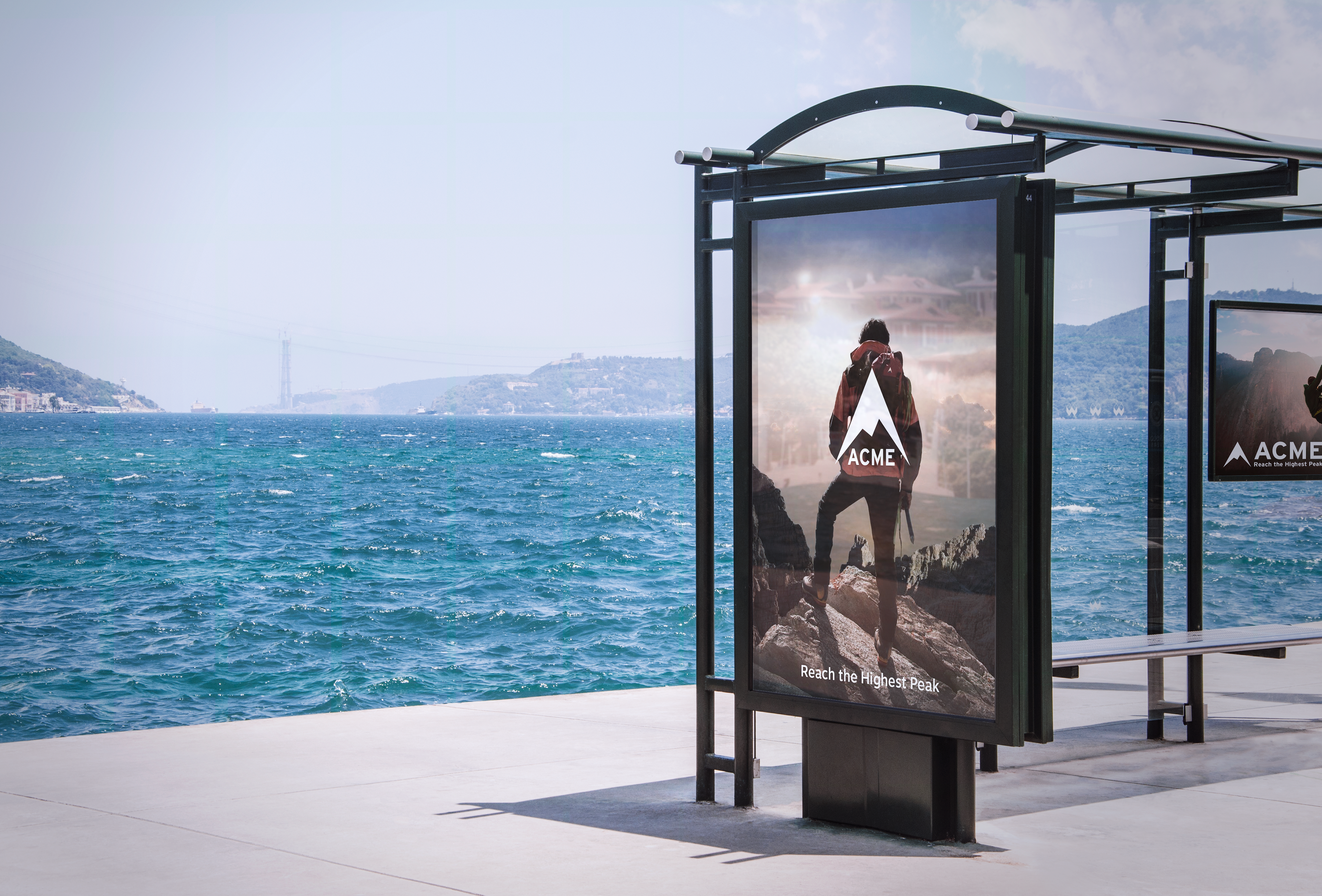
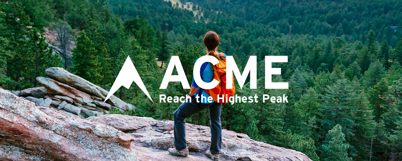
Bus stop advertisement of Acme
Fighting Fire with Fire
First, I had to research other companies within its industry as well as create a mood board that best expressed what I wanted my company to represent. When researching the competition, I noticed a trend that the advertisements showed customers using the products in more extreme situations. I learned that acme means "the point at which someone or something is best, perfect, or most successful", leading me to the tagline "Reach the highest peak".

Outdoor clothing companies competition: logos, products, & advertisements
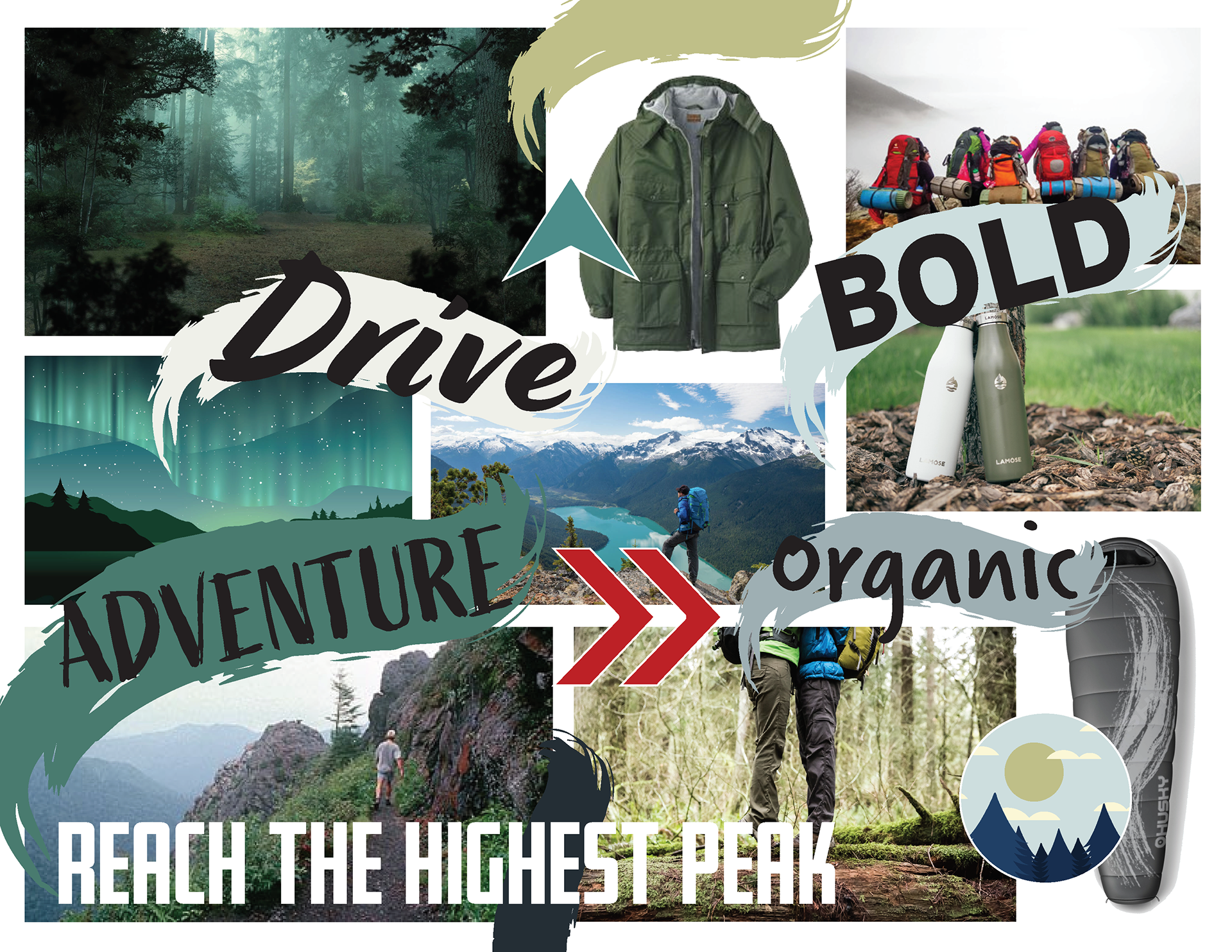
Mood board for Acme
Triangles Everywhere
When sketching ideas for the logo, I wanted the form to symbolize nature in some way as well as have a "peak" to further emphasize the tagline. It was fortuitous that not only do many things found in nature have a triangular shape: mountains, trees, and arrowheads, but also the letter "A". After a series of sketches and iterations, I decided on developing the mountain head shape. Because of its simplicity, it is easy to recognize, remember, and replicate, all important qualities for good logos.
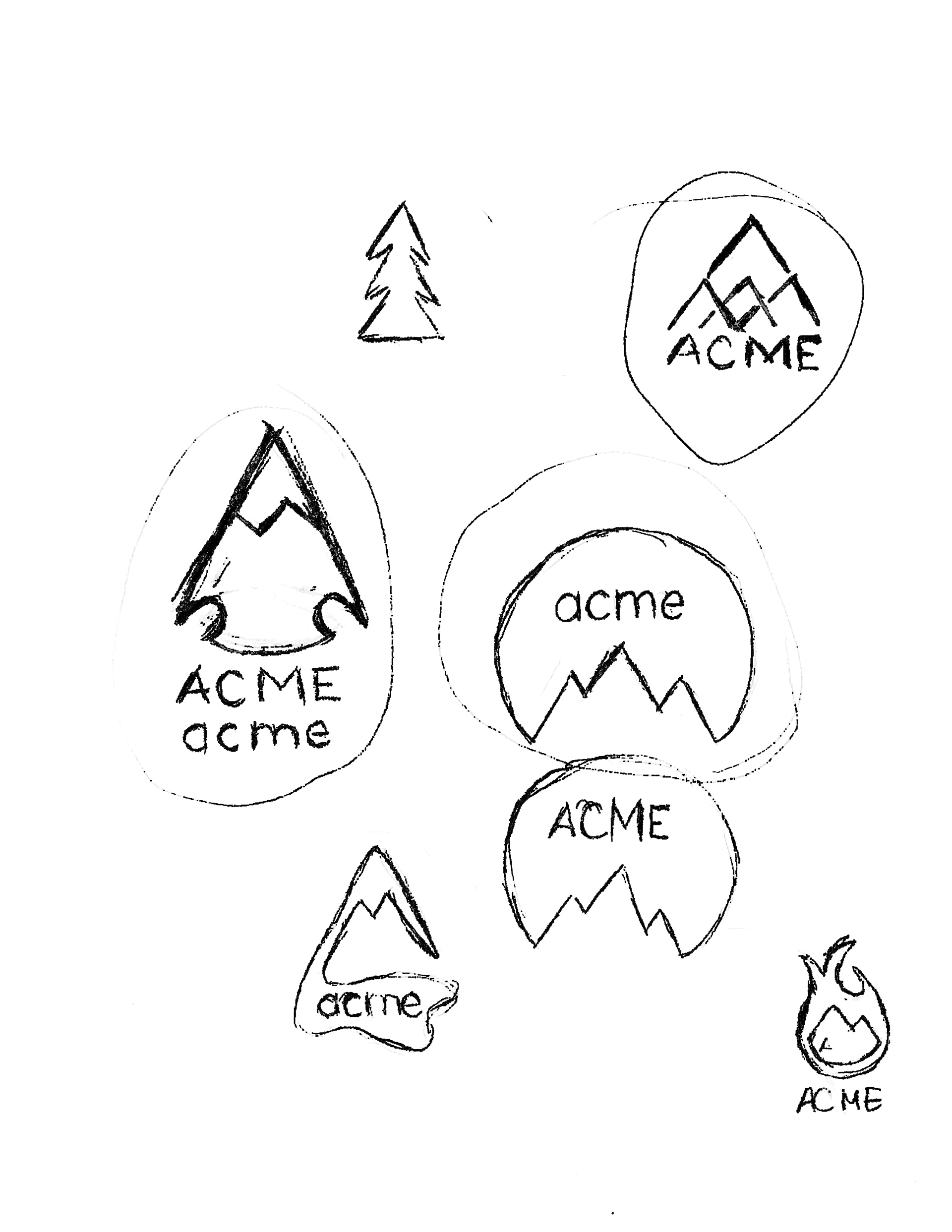
Preliminary logo sketches for Acme

Preliminary logo sketches for Acme
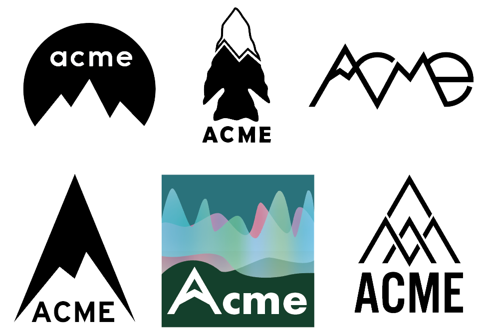
Refined sketches of top logo options
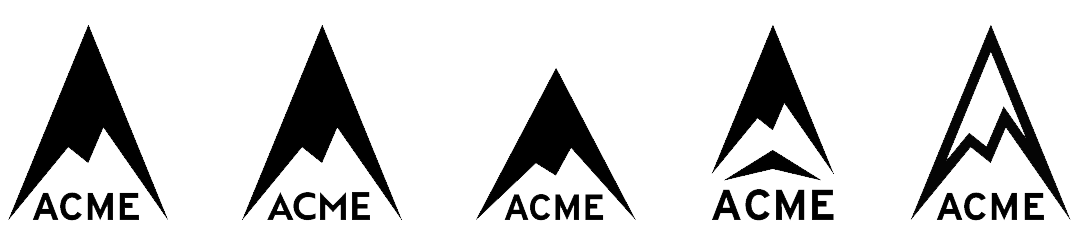
Iterations of final logo option
The Highest Peak... Kind of
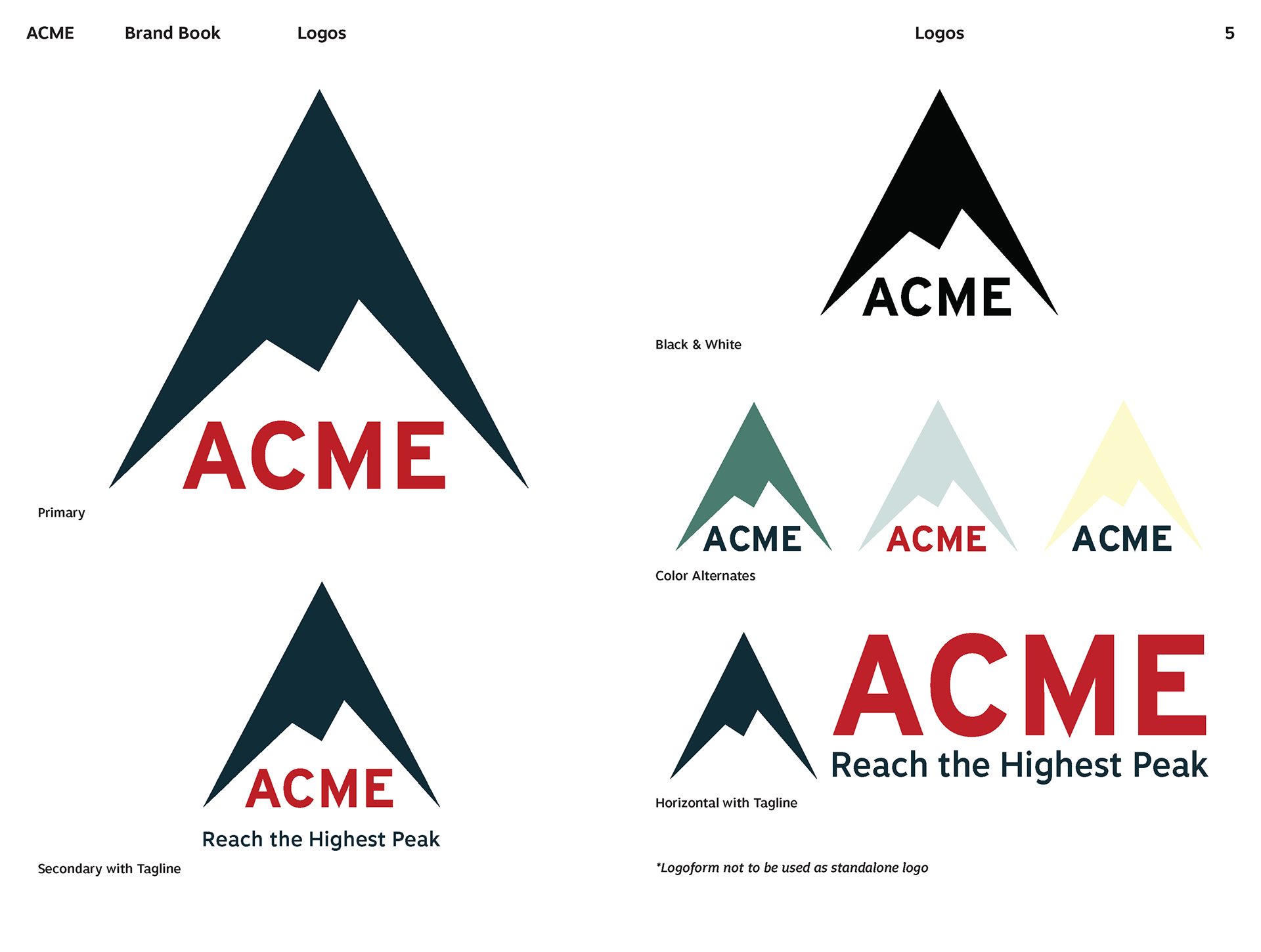
With its bold and dynamic mountain head, which also functions as an arrowhead, my final design best portrays the feeling I want to convey with my brand: reach the highest peak. I shortened the peak of the mountain to create a more balanced look to the logo. With the more equilateral shape and the bolded, square font, the logo appears grounded.
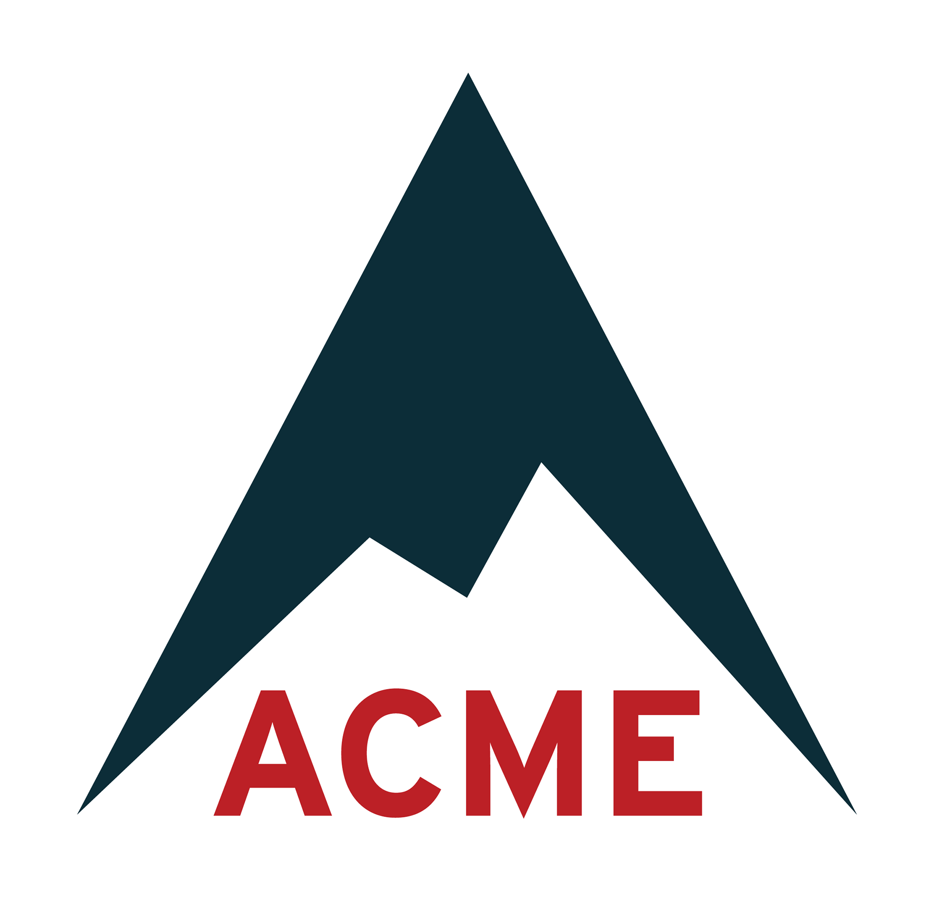
Final primary logo for Acme
Acme advertisement with horizontal logo
Adventure is Out There
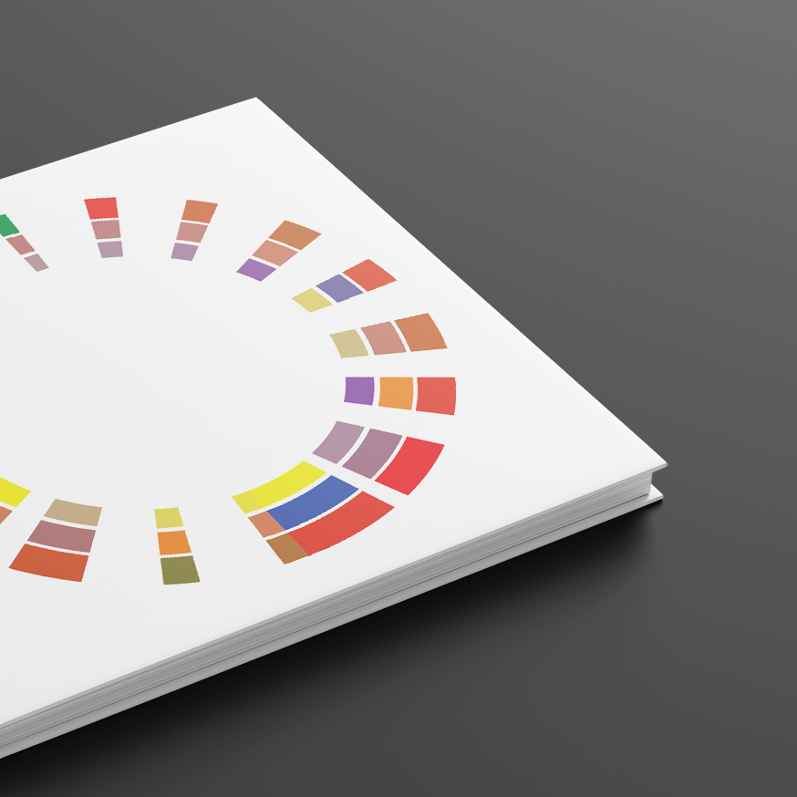
To finalize my company identity, I designed a brand book. Mimicking the logoform, colors, taken from nature, exist in varying sized triangles to serve as a visual representation of the percentage use of these colors within the brand. The header font Interstate Bold lends well due to such letters as ‘t’ and ‘p’ having ends that come down to a point, while Motiva is legible and not as decorative. Having the triangle shape appear consistently throughout the brand book, helped forge the vision of high performance, endurance and reliability.
While the project posed the great challenge of trying to stand out in an industry with very prominent, dependable companies already in existence, I loved that it forced me to think both out of the box, while also taking note of what makes those companies as successful as they are. Ultimately, it was extremely rewarding to be able to create an entire brand from a name alone.
Brand book pages: logo pack for Acme

Brand book pages: brand colors and fonts
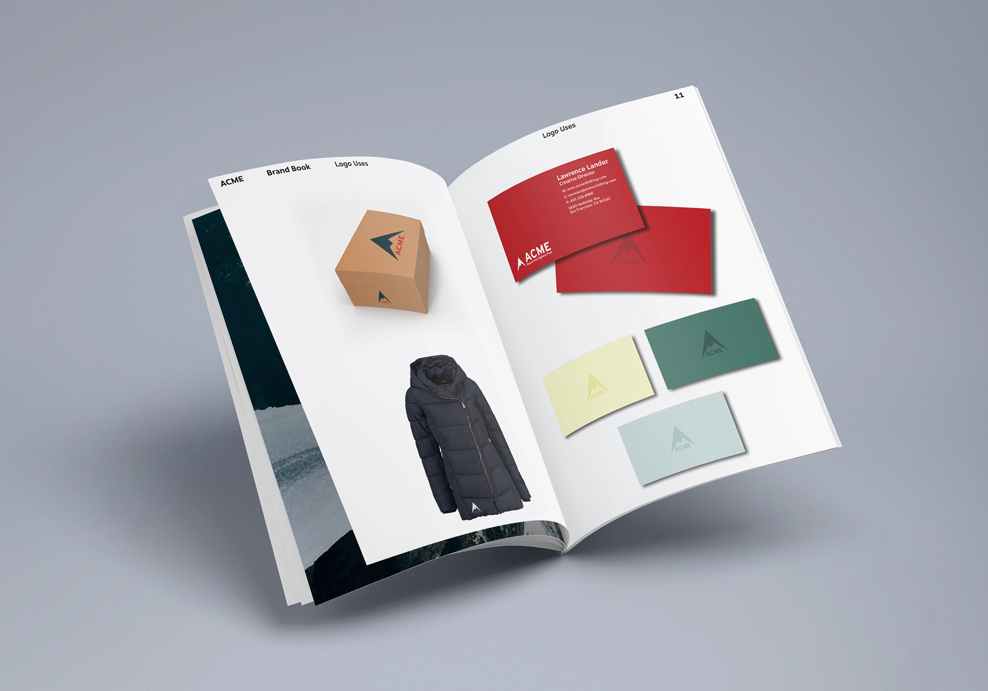
Brand book pages: sample products & business logos

Front and back cover of brand book