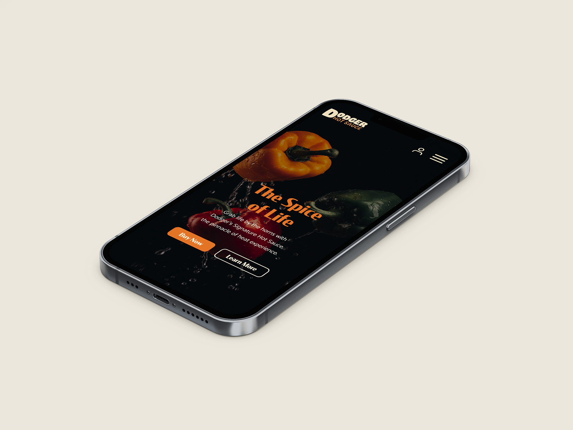
Home page of Dodger Hot Sauce website
The Spice of Life
Dodger is a hot sauce company offering unique flavors with the vision of competing with popular brands such as Truff and Secret Aardvark.
Problem: How might we design a website to create an engaging but efficient experience when purchasing products?
Solution: Design a visually stimulating platform where the calls to action are easily accessible to reduce mental processing time.
Role: As the sole designer for this project, my responsibilities included wireframing, developing a style guide and components, and prototyping.
Duration: 1 week sprint
Felipe's User Journey
The ideal customer is a man named Felipe. Felipe is in their 50's and is single with no children. They are a high school graduate and work for themselves. Felipe lives in San Francisco, is very familiar with Dodger Hot Sauce and likes to buy products recommended by their favorite influencers.
As an individual already familiar with the company, the main user flow for him is an ecommerce purchase of one of the hot sauces.

Ecommerce purchase work flow
Wireframes
Based on the basic task flow, I developed wireframes that brings the user directly from the homepage to the cart with the click of a button. While I still created a wireframe for the product details, this flow differed from the original, which required a visit to the product page prior to purchase. However, with the persona in mind, it is assumed that the customer is already familiar with the product and wants to purchase immediately.
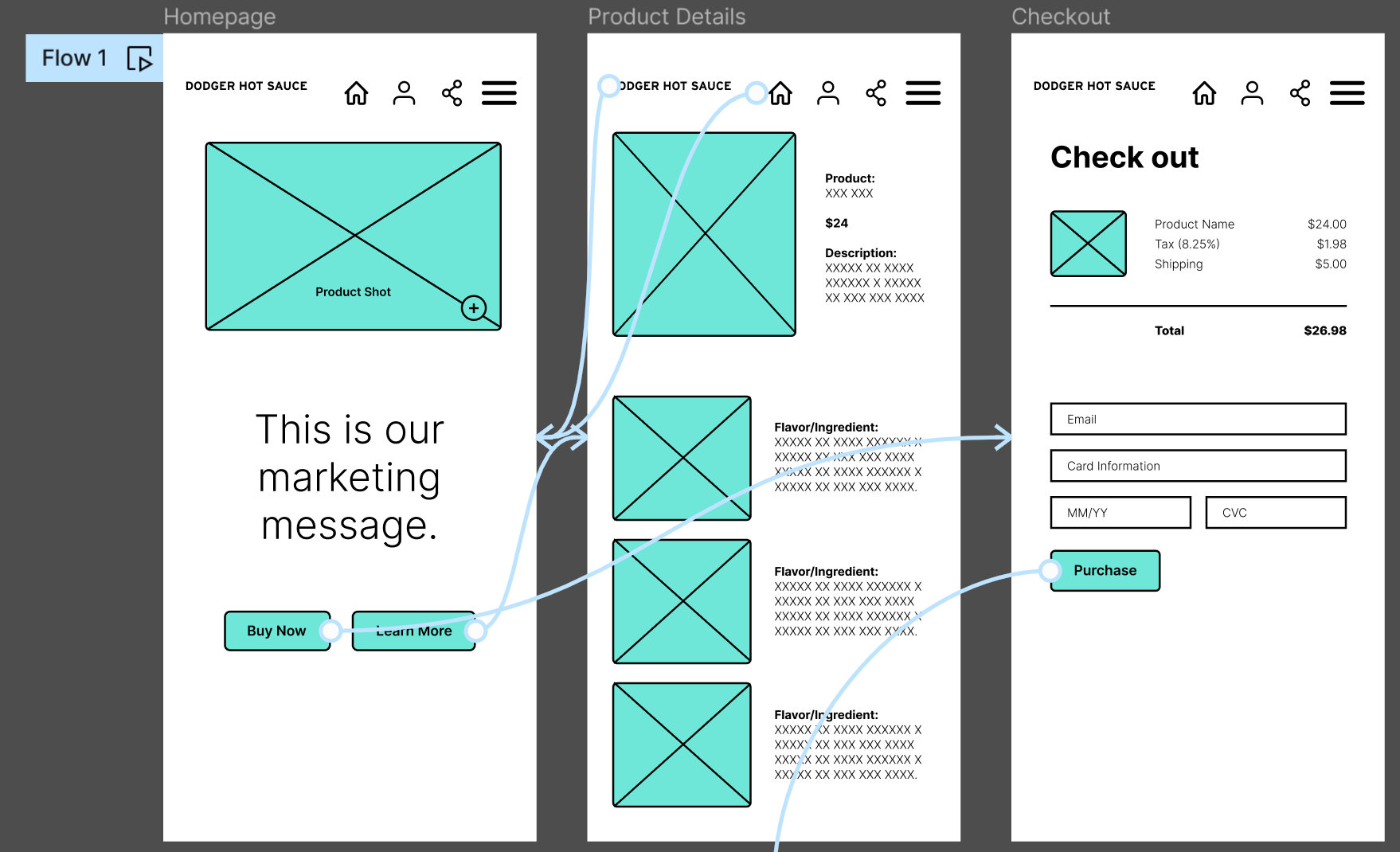
Wireframes of home, product details, and checkout pages, showing flow between pages on Figma
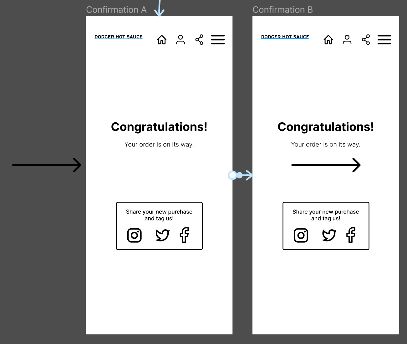
Wireframes of confirmation page, showing smart animation flow on Figma
Moodboard & Style Guide
I researched other hot sauce companies as well as ecommerce companies from other industries. I created a moodboard from this research that fit the type of consumer that would purchase these hot sauces.
Because it is a hot sauce company, I really wanted to emphasize the bright bold flavors and how they pack a punch. With that in mind, I developed a style guide with a color palette and text styles that embraced these qualities.

Moodboard for Dodger Hot Sauce

Style guide page showing text and color styles, also defined on the right-hand side
Components & Variants
Because it is difficult to gain trust with consumers being exclusively online, I knew it was important to be consistent across the website. I researched the design systems of well-established companies such as Apple and Google in order to understand the types of components they utilize across their platforms. From there I developed my own set of common components, mimicking shapes and icons that are already familiar to people. I also grouped them as variants with layering properties to increase consistency and efficiency when building out the website.
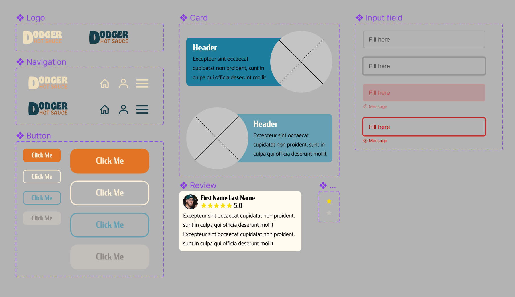
Components and their variants. Properties include light mode vs dark mode, active vs inactive, primary vs secondary, etc.
High Fidelity Prototype & Demo
Once all the individual parts were established, I created a high fidelity prototype.
Key Features:
Call to action - The priority call to action on any ecommerce site is to make a purchase. I designed every page to have a "Buy Now" button to expedite the process. I also differentiated it from other actions by increasing the contrast, drawing the attention of the consumer.
Imagery - One key part of the persona is that they like to buy products recommended by their favorite influencers. With this in mind, I prioritized imagery with real people using or taking a photo of the product. This increases the trust between the company and the consumer and entices them to purchase it for themselves.
Testimonials - In addition to showing real people using the product, product reviews are also important to gain consumer trust. This reassures the consumer that not only influencers, but people like themselves also purchase this product.
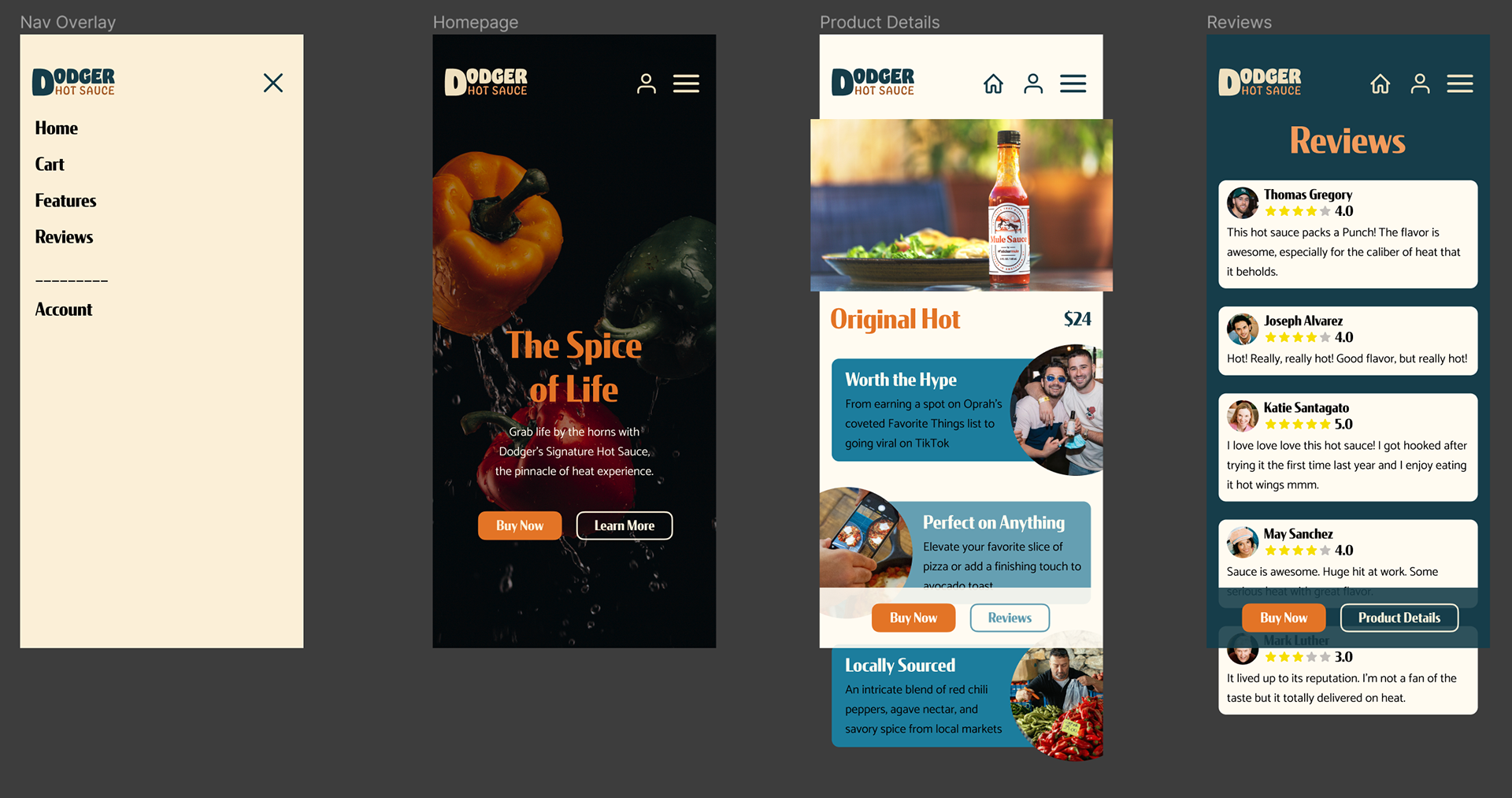
High fidelity prototype of home page, product details page, reviews page and navigation overlay
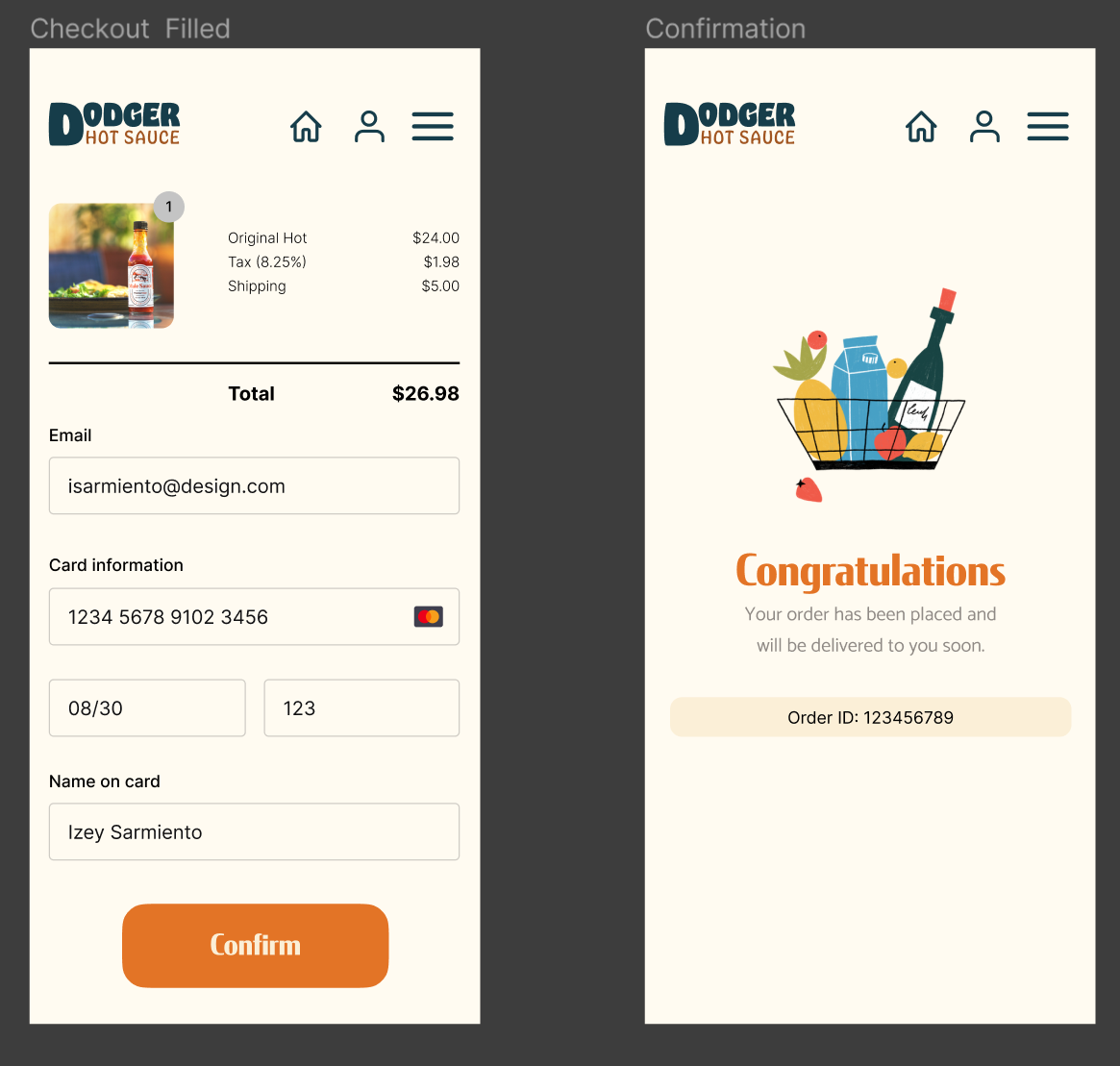
High fidelity prototype of checkout page filled out and confirmation page
Demo of ecommerce purchase
Demo of product details and review pages as well as navigation overlay
Demo of error messages in the purchasing process
Kicking It Up a Notch
With the main user flow achieved, I am able to deliver my design as-is. From here, I am able to begin user testing and further refine the design. Additionally, I will continue developing additional features such as other product pages, an account page to track previous purchases, and a desktop version.
The key takeaway from this process is that I am designing for the user. I am able to achieve this successfully by designing based on existing, trusted principles. Mental fatigue and disinterest increases when introduced to processes are not intuitive and unfamiliar. There is plenty of room to be creative visually without reinventing the wheel.
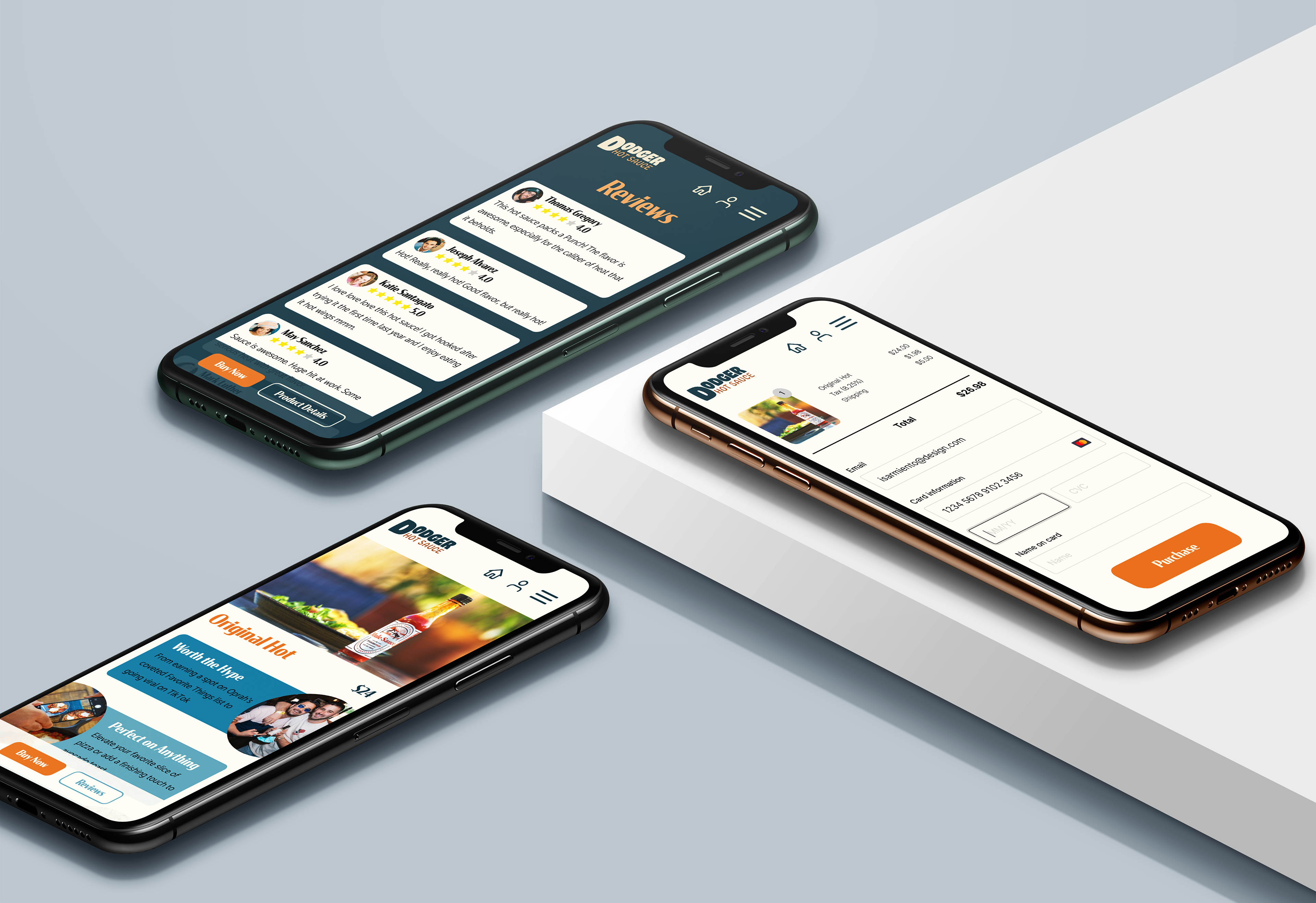
iPhones displaying various pages of the Dodger Hot Sauce website